The Cone of Stupidity
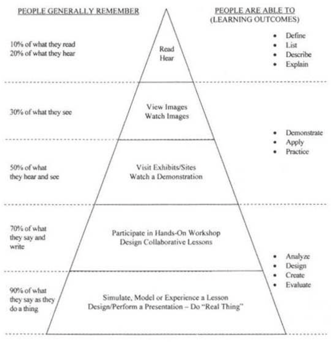
You have probably seen a version of this picture somewhere. Maybe it was a chart, or maybe it was a pyramid, or just a verbal list of percentages. Whatever it was, it made you stupider.
The original version of this was called a "Cone of Experience" and came from an actual education researcher in the early 20th century; the learning "modes," however, were not attached to learning outcomes or retention rates. It was just a way of organizing different kinds of activities that students could engage in.
Later, some unknown (but intrepid) individual added average learning or retention outcomes to each of these modes of learning. Made-up learning outcomes. Completely, utterly fabricated numbers created by someone who must have known that they are completely and utterly fabricated because there is absolutely no research support for any of these numbers and there never has been. Variations of the same basic idea flourished from there.
The citations that many of these charts have (to research articles and research institutes) are spurious. The cited article or institute (e.g., “Forrester Research Group”) usually exists, but provides no support to the numbers in the retention chart. Regardless, notice the shift once someone adds learning outcomes to the chart: what began as a descriptive object — here are some different things that are going on — ends as an empirical and prescriptive object — this is WHAT happens and, implicitly, WHAT SHOULD happen.
I suspect the original goal of adding retention outcomes was to support more active learning methods – to move away from a "students sit there and listen to what I tell them to do" model. Intertwined within this good idea, however, are ideas so bad that this chart did far more harm than good.
If good decisions are trees, the cone is poisonous soil.
Like so many other appealing myths, the cone apes the form scientific research only to mock it. The proposed retention rates are too clean: 10%, 90%, 50%. Research results don't look like that. Well, they're just estimates. Estimates of what? Learning outcomes measured how? Well, it's just to give people a general idea about how more active learning methods help. Then why attach fictional numbers to it?
More fundamentally, the cone asks people to pay attention to the wrong things. To have discussions and conversations about the wrong things. It is so far removed from what matters in memory and learning that "it's not even wrong".
I can tell you how much people remember from many simulations, self-presentations, and discussions – the supposed 90% category – 0%. Because the teacher thought that merely doing these activities was enough. They didn't focus on the important decisions: what the learning goals were and how to structure those activities to further those learning goals.
Ideas travel because of their appeal and because of how easy they are to explain or communicate. Not because of their validity, their provenance, or their utility.
The absolute best resource on this saga is: The Mythical Retention Chart and the Corruption of Dale's Cone of Experience: Special Issue of Educational Technology - Nov/Dec 2014. (Subramony and Molenda, ed.) Here, as of May 2023.
Member discussion